ENX - Corporate Figma UI Kit for Agencies & Consulting Brands

$40.00 $24.00 per year

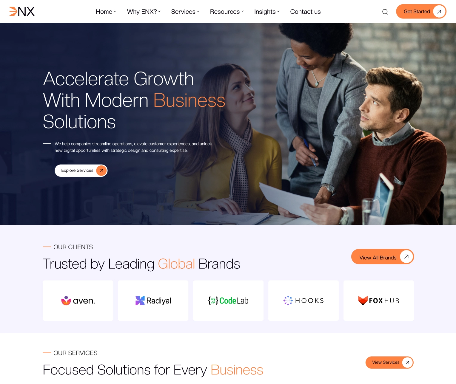
A 74-screen corporate Figma UI kit for digital agencies, consultancies, and B2B service brands – includes 2+ homepage variants, 4+ component libraries, 50+ UI elements, and matching mobile layouts.
License Options
Technologies
Figma: Enx - Corporate Figma UI Kit for Agencies, Consulting & Business Brands
Screenshots

A 74-screen corporate Figma UI kit for digital agencies, consultancies, and B2B service brands - includes 2+ homepage variants, 4+ component libraries, 50+ UI elements, and matching mobile layouts.

Enx is a corporate Figma UI kit designed for digital agencies, consulting firms, B2B service companies, and professional studios building credible business websites. It solves the "I need a polished corporate site that signals expertise - but most agency Figma kits look identical" problem. Built on Figma's component, variant, and variable systems, it ships with 37 fully layered desktop screens, 37 matching mobile screens, 4+ component libraries, and 50+ reusable UI elements organized for designer and developer handoff.

This kit is built for three buyer types: agency and consultancy founders launching a new corporate site, freelance designers producing client work for B2B brands, and in-house design teams who need a starting framework instead of a blank canvas. Designing a 37-page corporate site with case studies, services, team, and insights modules from scratch typically takes 60-90 hours. With Enx, you can swap brand colors, replace imagery, and adapt copy to deliver a complete corporate site in 6-12 hours. The component-driven structure means every brand update propagates across all 37 screens at once.

The kit covers 15+ page categories: 2+ homepage variants, About, Case Studies, Services, Our Team, Our Insights, Contact, FAQ, Testimonials, Privacy, Career, Support, Our Offices, Our Clients, and Sitemap. Every Case Study, Service, Team member, and Insight has a dedicated single-page template with bundled image collections, forms, and typography styles. The component library covers buttons, inputs, navigation, footers, cards, and modals as Figma components with variants. Color and font tokens are managed as Figma variables for one-click theme swaps.

Unlike generic corporate templates that ship as flat mockups, Enx is a true Figma system - built with grouped layouts, organized layers, variants, styles, and color and font variables that map cleanly to a production design system. It's particularly well-suited for agencies that want a credible corporate identity without spending weeks on design foundation work, and for in-house teams that need a starting framework they can extend over time. The pixel-perfect spacing and developer-friendly structure reduce handoff friction and speed up engineering review cycles.

Core Pages

  • Home (2+ variants)
  • About Enx
  • Why Enx
  • Case Studies Listing (2 layouts)
  • Case Study Detail
  • Services Listing
  • Service Detail
  • Our Team (2 layouts)
  • Team Member Detail
  • Our Insights (2 layouts)
  • Insight Detail
  • Contact
  • FAQ
  • 404
  • Testimonials
  • Privacy Policy
  • Terms & Conditions
  • Cookie Policy
  • Licensing
  • Data Protection
  • Career
  • Support
  • Our Offices
  • Our Clients
  • Sitemap

What’s Included

Files & Screens
  • 37 fully layered desktop screens
  • 37 matching mobile screens
  • 2+ homepage variants
  • Single-page templates for Case Studies, Services, Team, Insights
  • Image collections bundled with single-page templates
  • Figma source file (.fig)
Components & Design System
  • 4+ organized component libraries
  • 50+ reusable UI elements
  • Editable Figma components with variants
  • Color variables for one-click theme swaps
  • Typography variables and modular type scale
  • Reusable form components and patterns
Quality & Structure
  • Pixel-perfect spacing and alignment
  • Grouped layouts for easy section editing
  • Organized layers with clear naming conventions
  • Developer-friendly structure for clean handoff
  • Free Google Fonts included
  • Works with Figma latest version and Figma Community

Who It's For

This kit is built for:

Digital agencies and creative studios

Building / storefront You'll benefit from Enx if you run an agency and need a credible corporate site that showcases case studies, services, team, and insights. The pre-built modules eliminate weeks of foundation work, letting you focus on agency-specific positioning and brand voice.

Consultancies and B2B service brands

Briefcase Use Enx when you're launching or rebranding a consultancy, advisory firm, or B2B service company. The Services, Team, and Insights modules signal professional expertise, and the Case Studies templates let you demonstrate measurable client outcomes.

Freelance designers delivering client work

Pencil / design tool Enx is ideal for freelance designers building corporate sites for agency, consultancy, or B2B clients. The component-driven structure means brand color and font swaps propagate across all 37 screens, reducing revision cycles and speeding up delivery.

In-house design teams scaling a brand

Users / team For in-house teams, Enx is a starting framework rather than a finished site. The variable-based color and font system, organized components, and clean layer structure make it easy to extend over time as your brand evolves.

FAQ’s

What's included when I buy Enx?
What's the difference between Personal, Business, and Agency licenses?
Do I need advanced Figma skills to use this kit?
Can I customize the colors and typography across all screens at once?
Is the kit compatible with the latest Figma version?
Are the components reusable across other projects?
Are the fonts free to use?

Customer Reviews

See what store owners are saying about performance and results.

0.00/5

0 Reviews & Ratings

0
0
0
0
0

Be the first to review “ENX - Corporate Figma UI Kit for Agencies & Consulting Brands”

Write a Reviews

Your feedback matters! Let others know what you think.

Changelog

v2.0.0 - Major Rebuild (current) [29 May 2026]

  • - Fully customized rebuild of the original v1.0.0 release
  • - Refreshed visual design with updated typography and spacing system
  • - Migrated to Figma variables for color and font management
  • - Expanded component library with new variants
  • - Improved layer naming and file organization for cleaner developer handoff
  • - Updated mobile screens for consistency across all 37 pages

v1.0.0 - Initial Release [29 May 2025]

  • - 37 fully layered desktop screens
  • - 37 mobile screens
  • - 2+ homepage variants
  • - 4+ component libraries
  • - 50+ reusable UI elements
  • - Single-page templates for Case Studies, Services, Team, Insights
  • - Image collections bundled with single-page templates
  • - Reusable form components and typography styles
  • - Free Google Fonts integrated
  • - Compatible with Figma latest version and Figma Community

Be the First to Showcase Your Project

Built something amazing with this product? Submit your website and get featured in our customer showcase gallery.

Add Showcase

Showcase Your Website

Show how you built your website using WebbyCrown products. Submit your site, share your experience, and get featured in our customer showcase.

"*" indicates required fields
Max. file size: 5 MB.
Privacy Overview

This website uses cookies so that we can provide you with the best user experience possible. Cookie information is stored in your browser and performs functions such as recognising you when you return to our website and helping our team to understand which sections of the website you find most interesting and useful.

Necessary

Strictly Necessary Cookie should be enabled at all times so that we can save your preferences for cookie settings.

Analytics

This website uses Google Analytics to collect anonymous information such as the number of visitors to the site, and the most popular pages.

Keeping this cookie enabled helps us to improve our website.

Marketing

This website uses the following additional cookies:

(List the cookies that you are using on the website here.)