Built by WebbyCrown Solutions — Need setup, customization, or integration help? Talk to our team.



WooCommerce Mobile App Template - Convert Store Into Mobile App
WooCommerce Mobile App Template helps WooCommerce stores create a mobile-first, app-style storefront experience without rebuilding the store from scratch. It adds configurable app access, mobile redirects, branded colors and themes, catalog and product layouts, cart, checkout, my account screens, and editable home-page sections for a cleaner mobile shopping flow. Built for WordPress and WooCommerce stores that want a PWA-style mobile storefront experience.


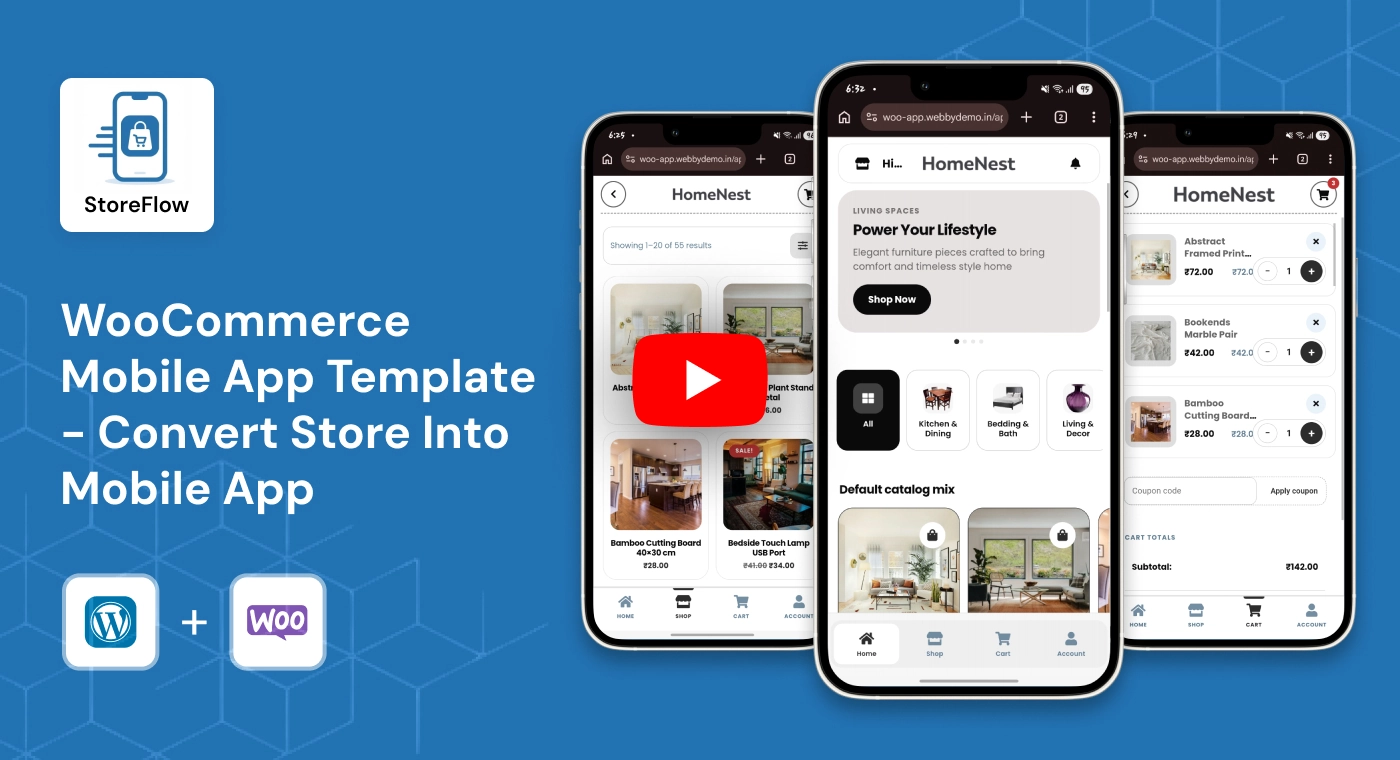
What Is WooCommerce Mobile App Template?
A standard WooCommerce storefront can work on mobile, but it may still feel like a desktop shop compressed into a smaller screen. Navigation, product browsing, cart actions, checkout steps, account management, and homepage sections can become harder to use when the store is not designed around mobile-first shopping behavior.
WooCommerce Mobile App Template adds an app-style storefront layer for WooCommerce. It helps store owners organize a mobile-first experience with app access rules, mobile redirects, brand colors, catalog and product layouts, cart, checkout, account screens, and configurable home-page sections. Rather than rebuilding the existing WooCommerce store, it gives the store a more focused mobile storefront experience managed through the WordPress admin.
Key Benefits

Mobile-First Storefront Experience
Present your WooCommerce store in a cleaner, app-style layout designed around phone and tablet shopping.

Store Access & Mobile Redirect Control
Control how visitors enter the mobile storefront and redirect eligible mobile users into the app experience.

Branded App Colors & Theme
Set app colors and visual styles that match your WooCommerce store identity across mobile screens.

Better Product Browsing
Give mobile shoppers a clearer way to browse the catalog, open products, and move through store content.

Cart, Checkout & Account Flow
Support mobile-first layouts for cart, checkout, my account, orders, addresses, downloads, and profile information.

Configurable Home Layout
Organize homepage sections, featured areas, and product content blocks for a more app-like storefront layout.

PWA-Style Storefront Design
Create an app-style WooCommerce shopping experience that feels more focused for mobile visitors.

Admin-Friendly Setup
Manage access, redirects, theme settings, layouts, and app sections from centralized WordPress admin controls.
Modules & Features
Storefront
Create a mobile-first storefront for better product browsing and a smoother app-style shopping experience. Help customers discover products, explore categories, use search and filters, and review product details more easily on smaller screens.
- Mobile-first homepage
- Product listing
- Categories
- Search
- Filters
- Product details
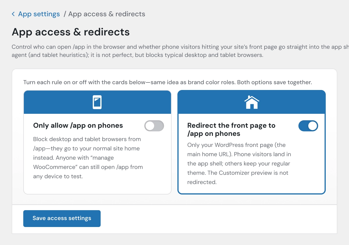
App Access & Redirects
Control how customers access the mobile storefront and how eligible visitors are redirected.
- Limit app access to selected users or visitors
- Redirect mobile visitors into the app experience
- Control how the mobile app template opens
- Support app-style entry for WooCommerce customers
- Improve mobile-first store navigation
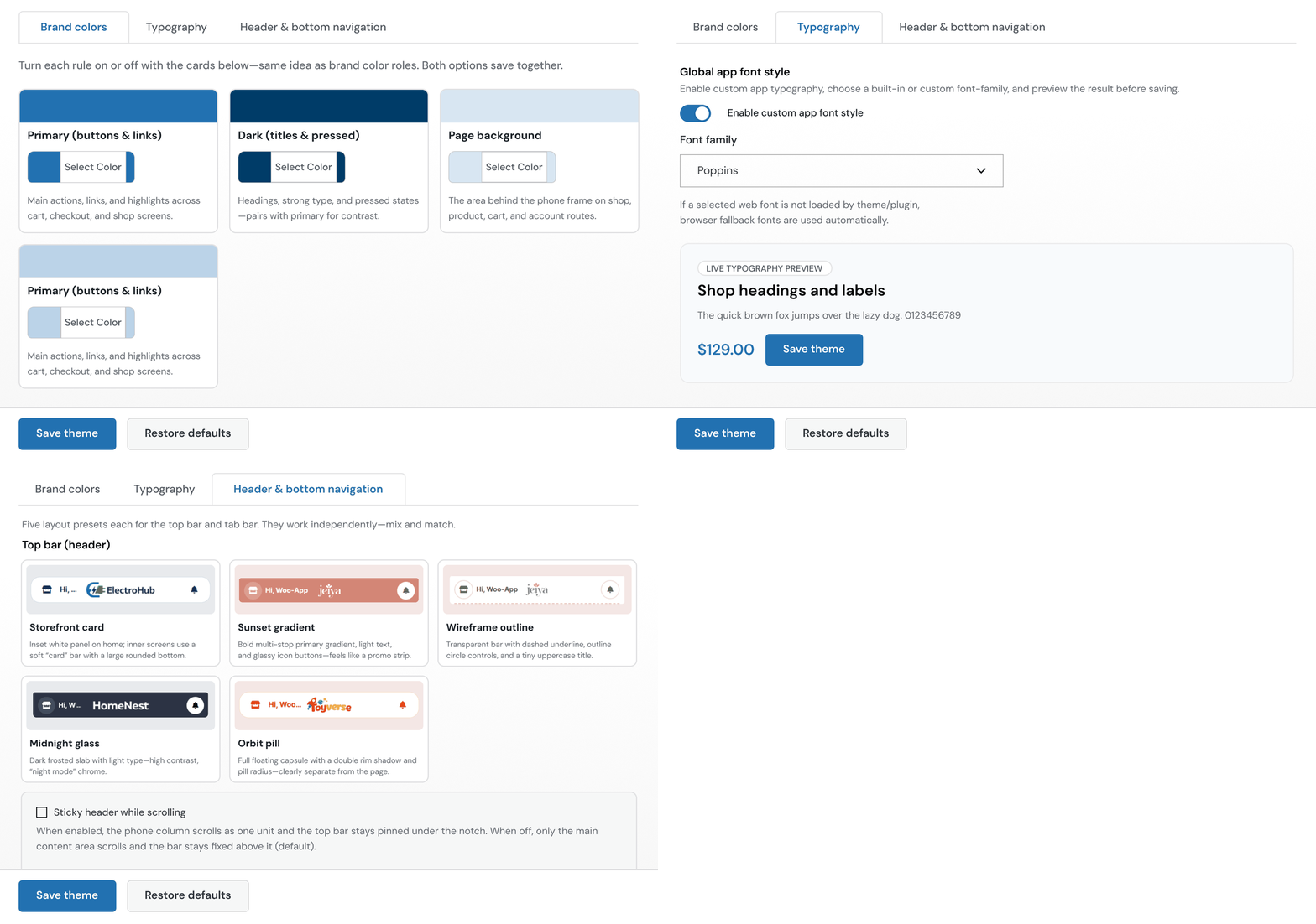
App Colors & Theme
Customize the mobile storefront appearance to match your store branding.
- Set app colors and theme styles
- Match brand colors across mobile screens
- Control primary and secondary visual elements
- Create a branded WooCommerce mobile store template
- Improve the overall mobile shopping experience
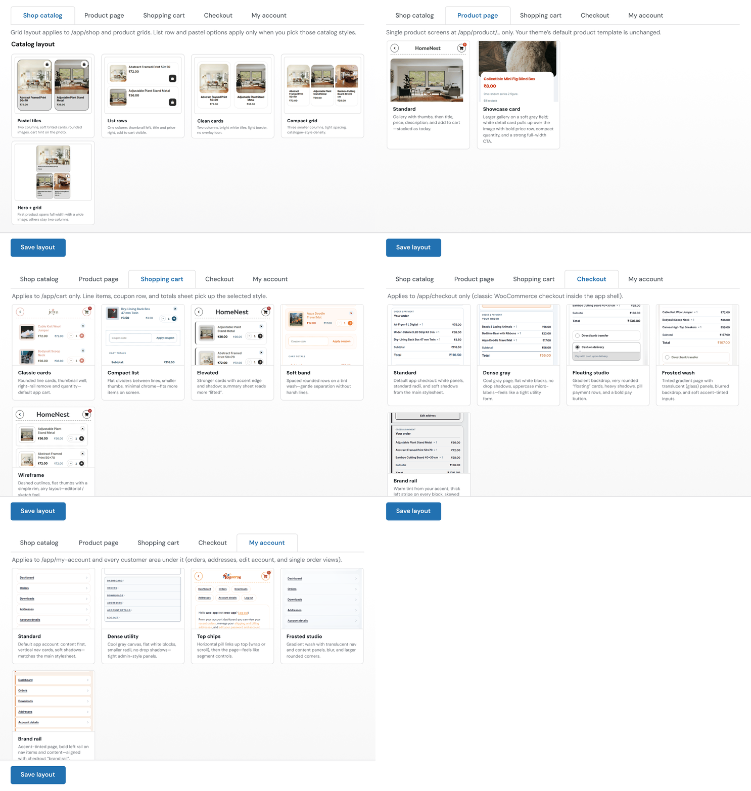
Catalog, Product Page, Cart, Checkout & Account
Manage the main shopping journey inside the mobile storefront.
- Display the product catalog in a mobile-first layout
- Present product detail pages clearly on smaller screens
- Support cart and checkout flows
- Show My Account dashboard and order history
- Manage addresses, downloads, and account details
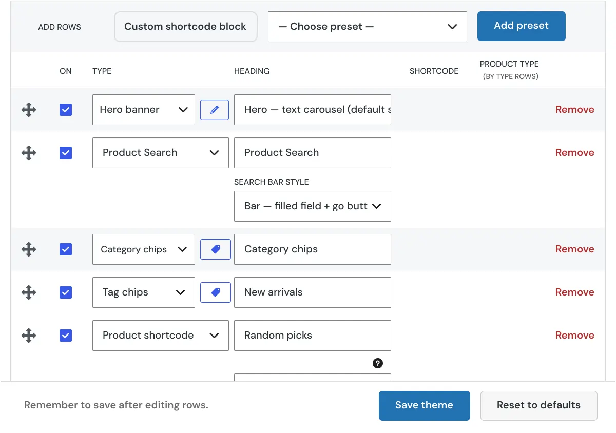
App Home Layout
Build a mobile-first homepage that highlights important store content.
- Reorder home sections and content blocks
- Show product sections and featured areas
- Control homepage layout for mobile users
- Create a cleaner app-style storefront
- Make store browsing easier on small screens
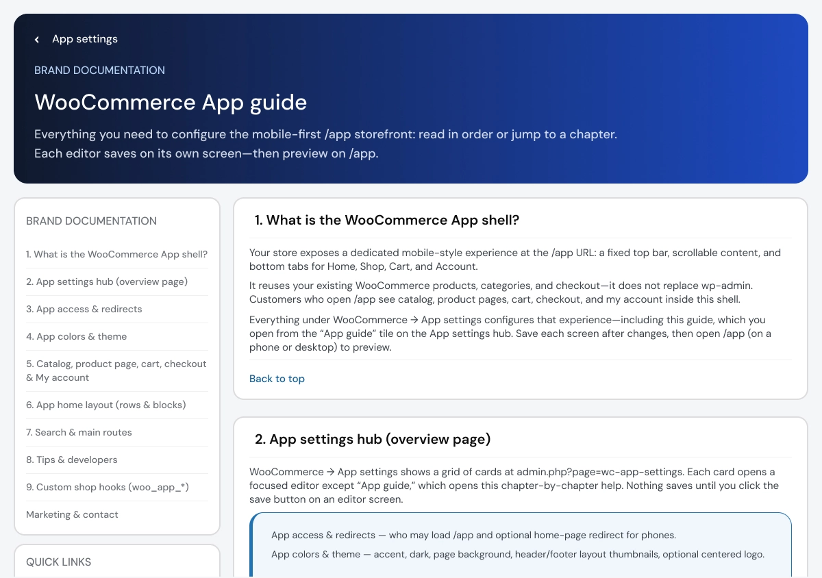
App Guide
Use built-in guide screens to understand each configuration area.
- Learn how app settings work
- Follow chapter-by-chapter guidance
- Understand home layout and screen controls
- Review catalog, cart, checkout, and account setup
- Make configuration easier for new users
Admin & Advanced Settings
WooCommerce Mobile App Template provides centralized WordPress admin settings for controlling the mobile storefront experience. Store owners can manage app access, mobile redirects, colors, theme styling, catalog layouts, product display styles, shopping screens, and mobile homepage sections without changing the core WooCommerce product, order, customer, or payment workflow.
The settings are organized into dedicated areas so administrators can configure how customers browse products and move through the app-style WooCommerce shopping experience on mobile devices.
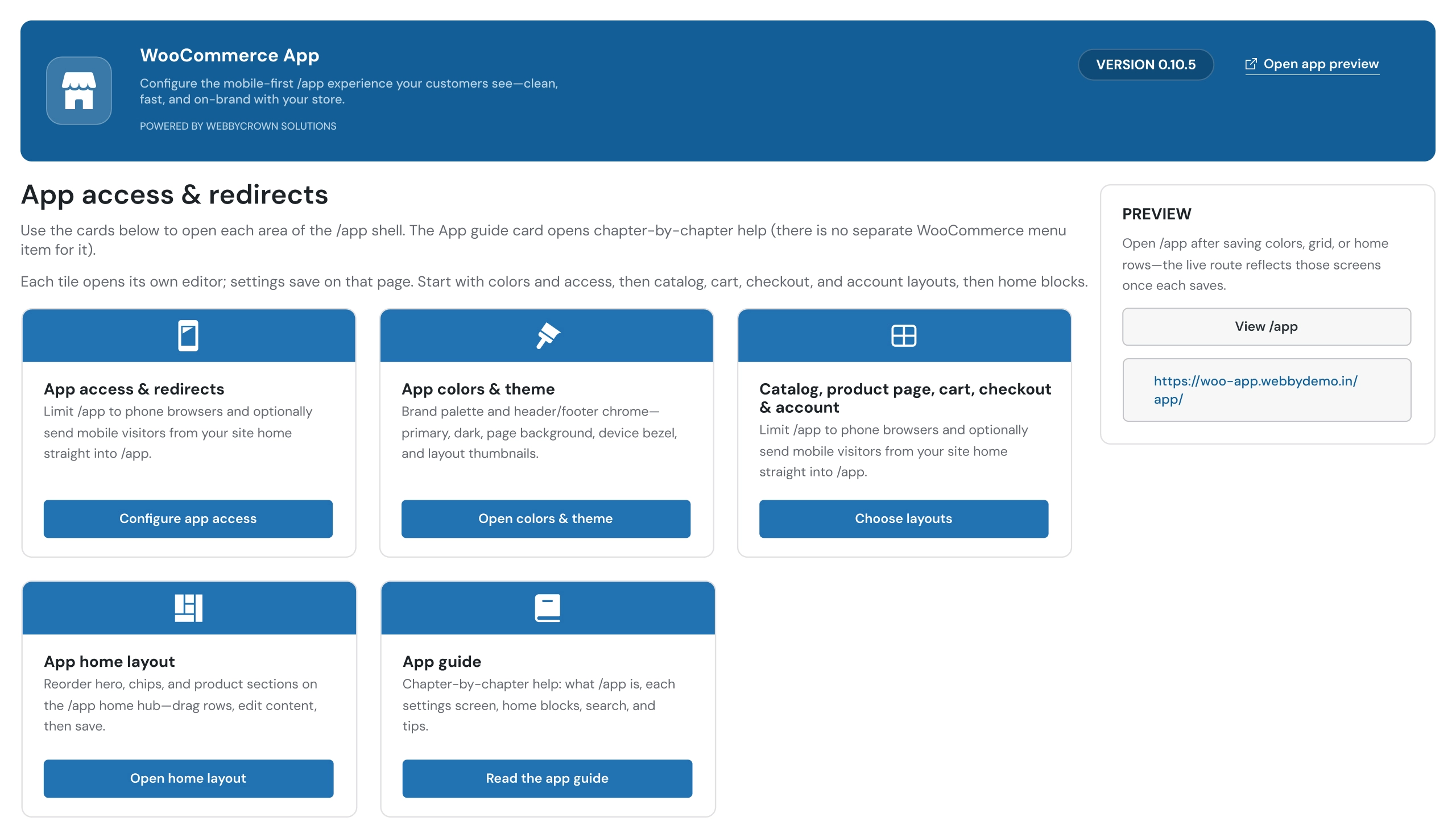
Manage the core mobile storefront experience, including access control, branding, layouts, and app structure from one place.
- Configure app access and mobile redirects
- Control how eligible visitors enter the mobile storefront experience
- Customize app colors and theme branding
- Manage catalog, product page, cart, checkout, and account layouts
- Configure mobile-first storefront navigation
- Organize mobile homepage sections
- Access setup guidance through the built-in app guide
Key Capabilities:
- App access and redirect controls
- App colors and theme customization
- Catalog and product page configuration
- Cart and checkout layout control
- Account page management
- Mobile storefront setup
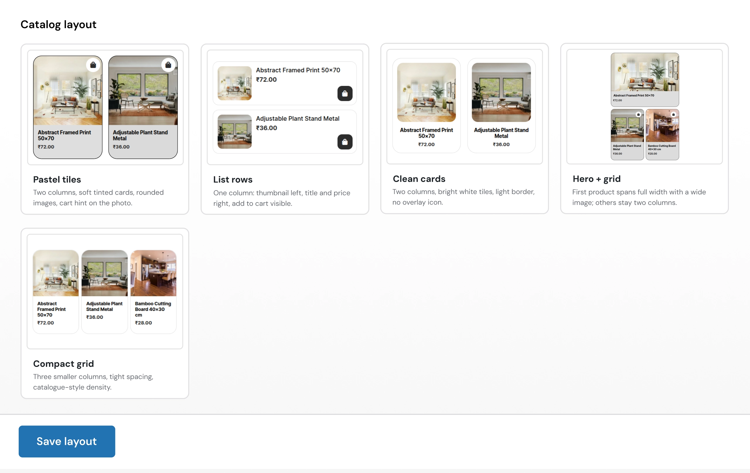
Customize how products appear inside the WooCommerce mobile storefront. Catalog layout settings control the product browsing experience for `/app/shop`, product grids, and mobile product listings.
- Select catalog layouts for mobile product browsing
- Configure grid-based product displays
- Use list-row layouts for compact product viewing
- Apply different product presentation styles
- Improve mobile shopping navigation
Available Catalog Layouts:
Pastel Tiles
Display products in modern tile-style cards with soft visual styling.
- Two-column product card layout
- Product images with clean card presentation
- Cart interaction directly from product cards
- Mobile-friendly shopping experience
List Rows
Show products in a compact list-style layout.
- Thumbnail-based product listing
- Product title and pricing display
- Quick cart access
- Suitable for stores with larger product catalogs
Clean Cards
Create a simple product-card layout with clear product visibility.
- Clean product presentation
- Easier product comparison
- Better mobile catalog browsing
- Suitable for minimalist store designs
Compact Grid
Display more products through a denser grid layout.
- Multiple products visible together
- Space-efficient storefront design
- Suitable for larger catalogs
- Mobile-focused product browsing
Hero + Grid
Highlight featured products with a larger hero section above the product grid.
- Featured product display
- Promotional storefront layout
- Product-focused mobile experience
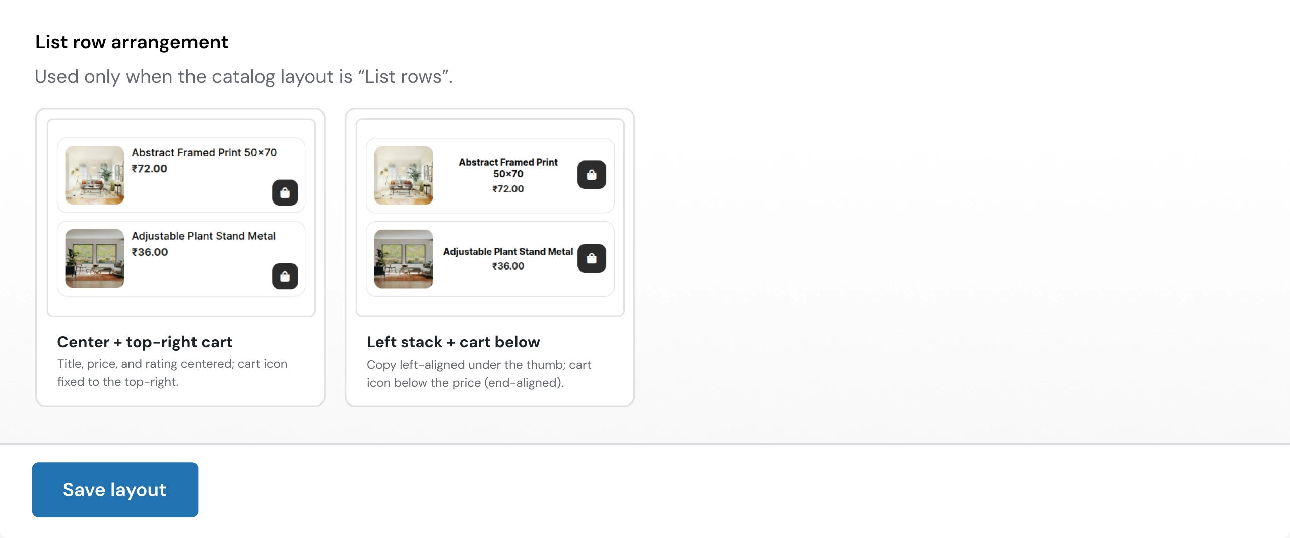
Configure how product information and cart actions appear when the catalog layout is set to List Rows.
- Control product information alignment
- Customize list-row appearance
- Improve readability for mobile shoppers
- Create a cleaner product browsing flow
Available List Row Styles:
Center + Top Right Cart
- Centered product title and price display
- Cart button positioned at the top-right
- Balanced mobile product layout
Left Stack + Cart Below
- Left-aligned product information
- Product details stacked below the thumbnail
- Cart action positioned below pricing
- More detailed product-row layout
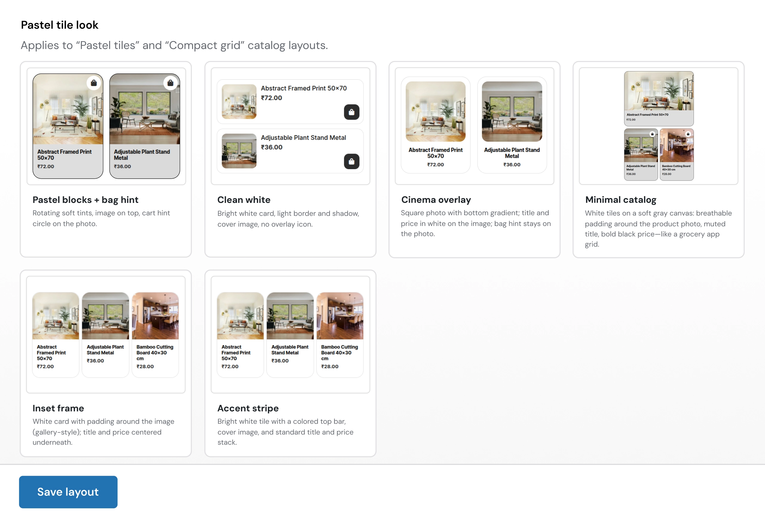
Customize the visual appearance of Pastel Tiles and Compact Grid catalog layouts.
- Adjust product-card presentation
- Create different storefront visual styles
- Improve mobile shopping appearance
- Match product layouts with store branding
Available Styles:
Pastel Blocks + Bag Hint
- Soft tile colors
- Product image-focused design
- Cart hint indicator on product images
Clean White
- Minimal white card design
- Simple product presentation
- Modern storefront appearance
Cinema Overlay
- Image-focused product cards
- Overlay product information
- Premium shopping style
Minimal Catalog
- Clean product grid
- Simple pricing and product display
- Lightweight mobile browsing
Inset Frame
- Product images inside framed cards
- Centered title and pricing
- Gallery-style product layout
Accent Stripe
- Highlighted product-card design
- Strong visual separation
- Modern eCommerce appearance
How to Set Up WooCommerce Mobile App Template
01
Install and Activate the Plugin
Install WooCommerce Mobile App Template in a compatible WordPress and WooCommerce environment using the included installation documentation.
Result: Mobile storefront settings become available in the WordPress admin.
Result: Mobile storefront settings become available in the WordPress admin.
02
Configure App Access
Choose how eligible visitors access the mobile storefront and configure redirect behavior where required.
Result: You control how mobile users enter the app-style experience.
Result: You control how mobile users enter the app-style experience.
03
Set Colors and Theme Styles
Configure colors and theme settings to align the mobile storefront with your store identity.
Result: Mobile screens reflect your brand more consistently.
Result: Mobile screens reflect your brand more consistently.
04
Configure Shopping Screens
Review the catalog, product, cart, checkout, and account layouts for your store.
Result: Customers can move through the mobile shopping flow more clearly.
Result: Customers can move through the mobile shopping flow more clearly.
05
Build the App Home Layout
Reorder content blocks, product sections, and featured areas for the mobile homepage.
Result: The storefront home screen is structured around your shopping priorities.
Result: The storefront home screen is structured around your shopping priorities.
06
Test the Mobile Experience
Test product browsing, cart actions, checkout, account pages, redirects, and layout behavior on supported mobile devices and browsers.
Result: Your WooCommerce store is ready for a more focused mobile storefront experience.
Result: Your WooCommerce store is ready for a more focused mobile storefront experience.
Who Is This Plugin For?
This plugin is suitable for:
- WooCommerce store owners improving their mobile shopping experience
- WordPress shops that need an app-style storefront layout
- Fashion, beauty, electronics, lifestyle, and product-based online stores
- Retail brands that want better mobile product browsing
- Businesses that need mobile-focused cart, checkout, and account pages
- Store owners who want branded app colors and theme controls
- Agencies building mobile-first WooCommerce experiences for clients
- Developers customizing WooCommerce stores for phone and tablet users
This plugin is not suitable for businesses that need a native Android or iOS application package, App Store or Google Play publishing, offline app functionality, push notifications, or a separate React Native or Flutter mobile app codebase.
Changelog
v1.0.0
- - Initial release with app access and redirects, app colors and theme controls, catalog and product page layouts, cart, checkout and account screens, app home layout controls, and built-in app guide screens.
Customers Reviews
See what store owners are saying about performance and results.
What is WooCommerce Mobile App Template?
WooCommerce Mobile App Template is a WooCommerce plugin and app template that helps create a mobile-first, app-style storefront experience for an existing WooCommerce store. It provides configurable access, redirects, colors, theme controls, shopping layouts, account screens, and home-page sections.
Can I convert my WooCommerce store into a mobile app with this plugin?
It helps convert the customer-facing WooCommerce experience into a mobile-first, app-style storefront. It is positioned as a PWA-style storefront template, not as a native Android or iOS app package for App Store or Google Play publishing.
Does it support a WooCommerce PWA template style?
Yes. The plugin supports a PWA-style, app-like storefront experience designed around mobile browsing and shopping. Confirm any separate PWA technical requirements, such as offline caching or install prompts, before publishing those claims on your store.
Can I customize the mobile storefront branding?
Yes. You can configure app colors and theme styles to match your WooCommerce brand across the mobile storefront screens.
Does it support product pages, cart, checkout, and account pages?
Yes. The plugin includes mobile-first support for catalog pages, product detail pages, cart, checkout, My Account, orders, addresses, downloads, and account details.
Can I redirect mobile visitors into the app experience?
Yes. The plugin includes app access and redirect settings that help control how eligible mobile visitors enter the app-style storefront.
Can I customize the mobile homepage layout?
Yes. You can reorder homepage sections and content blocks, show product sections and featured areas, and organize the mobile home layout around your store priorities.
Does it include payment gateway integration?
The plugin supports cart and checkout layouts. Payment gateway availability and checkout processing depend on your existing WooCommerce configuration and active payment plugins, so test the complete checkout flow on staging before going live.
Does it require WooCommerce?
Yes. The product is designed for WordPress WooCommerce stores and uses WooCommerce catalog, product, cart, checkout, account, and order workflows.
Which browsers are supported?
The product is designed for modern browsers including Google Chrome, Mozilla Firefox, Safari, Microsoft Edge, and Opera.
Which WordPress and WooCommerce versions are supported?
The product details list compatibility with WordPress 6.8.x and WooCommerce 9.8.x.
What changed in the latest version?
Version 3.1.0 added country-wise price rule support for products, categories, tags, and global pricing rules.
Be the first to review “WooCommerce Mobile App Template - Convert Store Into Mobile App”